SUMMER COLOR PALETTE

For Summer 23, newness was delivered through the use of color, this season’s key colors are driven by a mix of optimistic energy. Tranquil Blue, Fondant Pink, Astro Green, and Sunny Yellow…There is a need to balance creative confidence in print and color with commercial and long-term options. Perennial print and colors take the lead and we see the return in growth in core color groups.

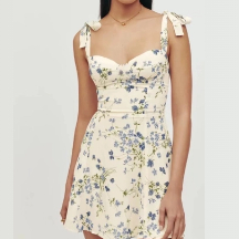
Injecting a sense of uplifting warmth and elevated optimism to Milan collections, SunnyYellow is emerging as a key summer bright. Seen across NY, London, and now Milan at Del Core, this bold primary shade works perfectly for statement dresses and occasion wear as a directional color choice. According to S/S 23 color shifts YoY, the proportion of Sunny Yellow is 15.0%.

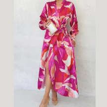
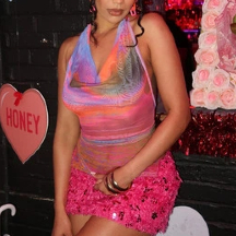
Fondant Pink is a pigmented pastel with an easygoing and youthful appeal. This is a sweet shade we see moving into a key gender-inclusive tone, so we’re excited that premium brands are already adopting it to tap into the conversation around.

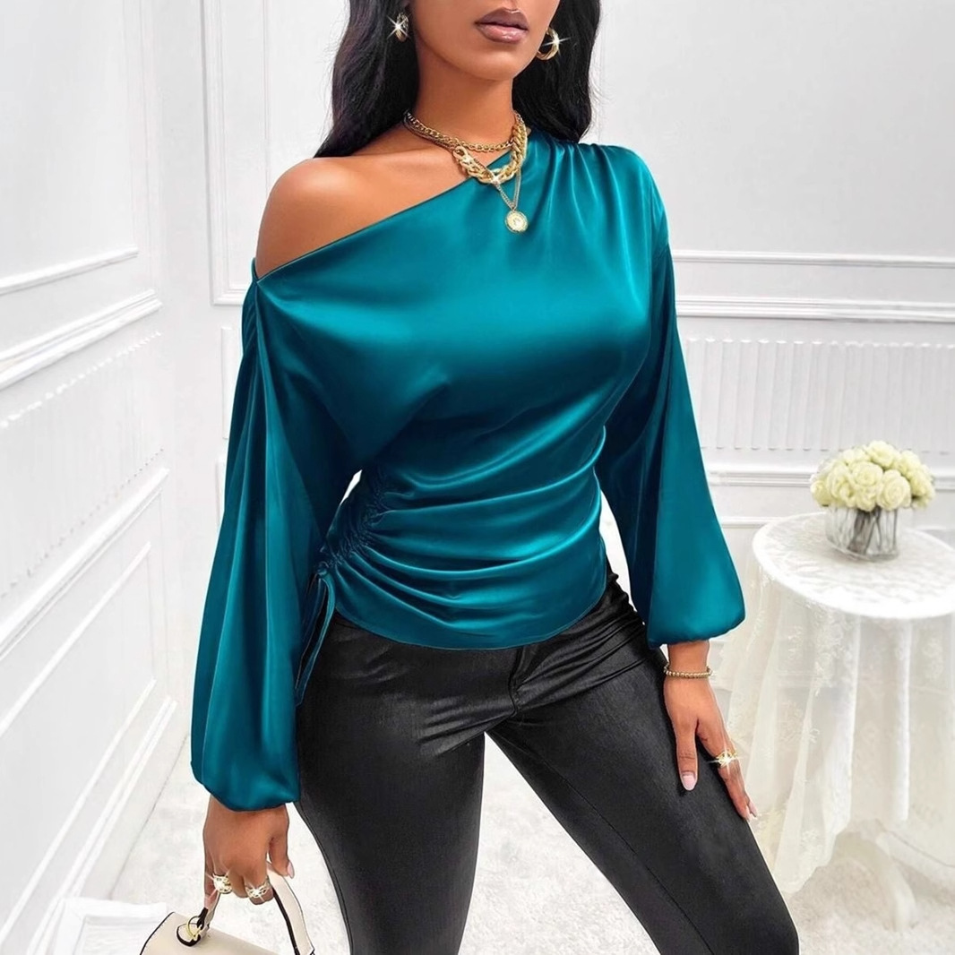
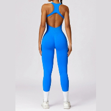
Tranquil Blue is a bright mid-blue that calls to mind the lightness of air and water. This shade connects to sustainable values and natural elements, resonating well with consumers that want balance and stillness.

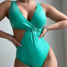
The bold and bright shade of Astro Green was seen across the streets as we see a renewed interest in eye-catching shades that create an immediate impact on social media in real life. We’re seeing influencers embrace this shade across outerwear and accessories for a statement look.











.png_1497272767152652288.png?x-oss-process=image/resize,w_300/format,webp/)
.png_1493304702564040704.png?x-oss-process=image/resize,w_300/format,webp/)
.png_1487136054371680256.png?x-oss-process=image/resize,w_300/format,webp/)
.png_1482048412462350336.png?x-oss-process=image/resize,w_300/format,webp/)
.png_1476984468647444480.png?x-oss-process=image/resize,w_300/format,webp/)
